
1920s Original Design
Featuring Thermo catalog materials from the 1920s, my original design was based off of the art deco style and advertisements of the decade. This design was pitched to business partners

1920s Final Design
This is the final submitted design for the 1920s after revisions from the creative director. Many of the original components were used to spark the inspiration behind the final product.
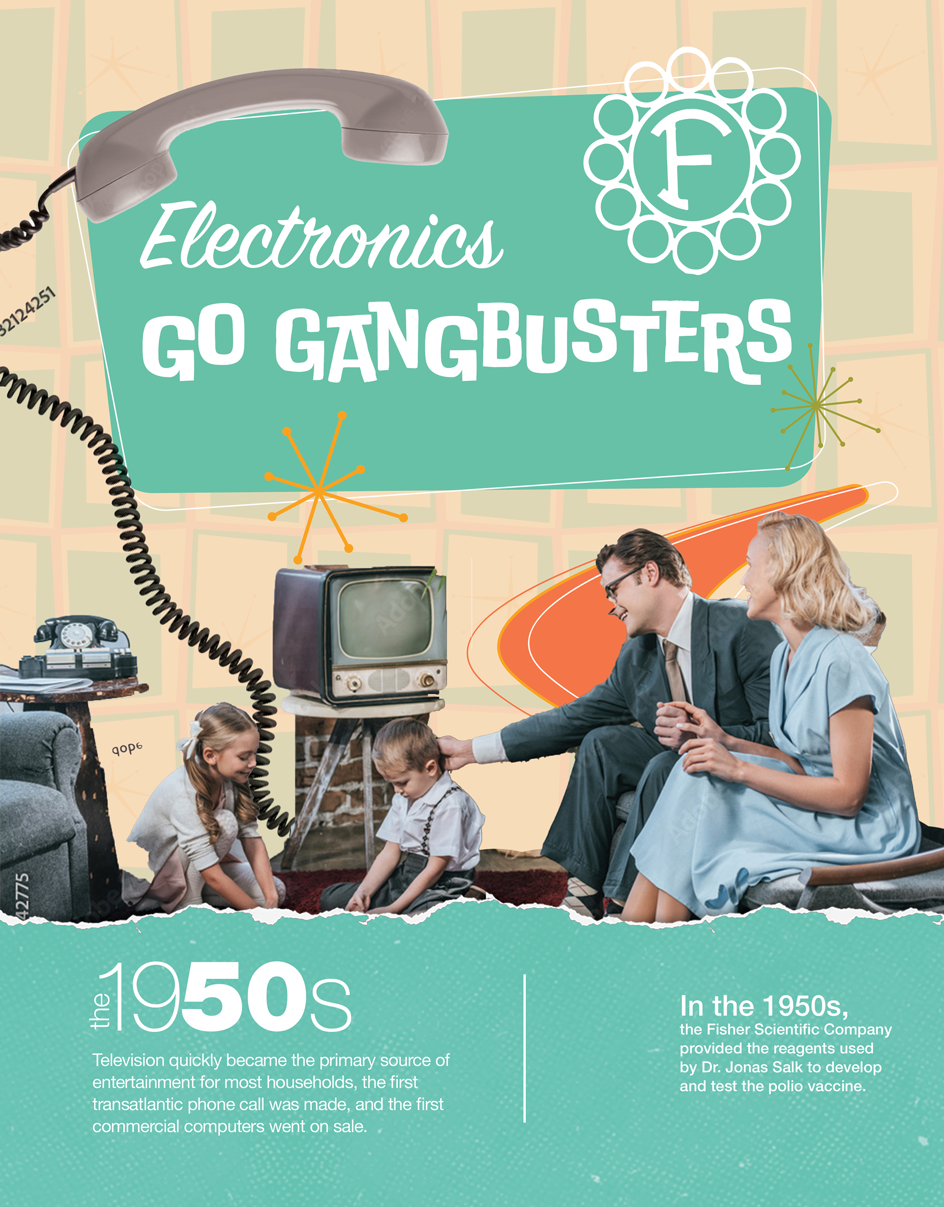
1950s Rough Original Design
This design highlights the fun geometric shapes and colors of the middle of the century and centers around a family of that time period. In addition, it contains a Fisher Scientific logo from a 1954 Fisher catalog to show the evolution of the company.
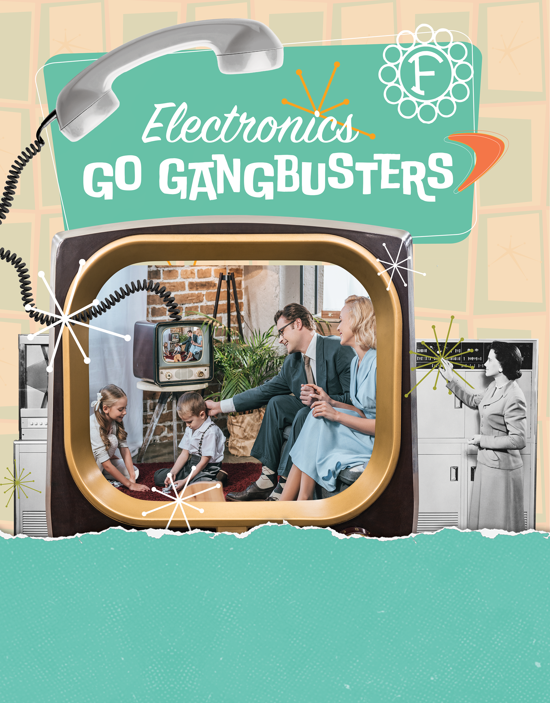
1950s Final Design
A television and computer in the background was was added per advisement from the CD to reflect the copy in that would go in the blue section.
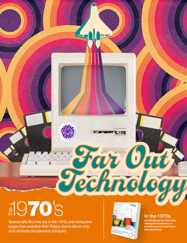
1970s spread
For the 1970s, I took a psychedelic approach with bright and fun colors. This was almost the final version after revisions from the creatice director.

1970s spread
In the original concept, I incorporated actual images from previous Fisher Scientific catalogs. Hours were spent trying to find the perfect image.